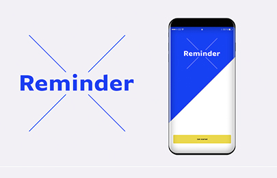
Reminder X
App
Reminder X (Academic Project — Kent State University) — UX Design
UX Design
Reminder X (Academic Project — Kent State University) — UX Design
Overview
Reminder X is a fictional company created as part of the Usability course in the Master's program at Kent State University. The app was designed to assist people with setting reminders for everyday tasks and goals — starting from a basic to-do list and evolving into a differentiated product through research.
The Challenge
The client (Reminder X) had an app that served as a simple to-do list. They wanted to understand what direction to take the app in terms of user needs, and identify critical features to add as they began planning a redesign. Their goal was to use research to find differentiators from competitors in the market.
Approach
I followed a full UX discovery process: Discover (user research, on-location interviews, observations) → Define (data synthesis, competitive analysis, affinity mapping, personas) → Ideate (design tenets, user flows) → Design (low-fidelity wireframes, visual design learnings). I interviewed four candidates — two men, two women — observing them complete tasks inside their native reminder apps.
Outcomes
Competitive analysis revealed significant UX gaps across existing apps: poor visual feedback, lack of onboarding tutorials, and missing advanced features. The research produced a clear product roadmap and prioritized feature set to differentiate Reminder X from competitors — directly informing the app's redesign direction.
— Gallery
4 images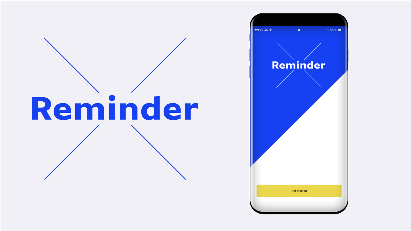
Reminder X — Overview

Competitive Analysis
App Design
Research Insights
Let's talk about what you need. I'll tell you honestly whether I'm the right fit.
Start a Project
Thanks — I'll get back to you within 1–2 business days.
Ask a question or search for a project, service, or client.
↵ search · ESC close · / open search